Why is Excalidraw so fucking good?
Disclaimer: This may read like an ad. It's not. No one's paying me to say this, I just love this product.
Excalidraw. Is. So. Good.
Why? When you first open it, it looks kind of sloppy. It almost evokes Kidpix, or something. Let's dig into what makes it 👨🍳💋 from a product perspective.
My threshold for trying new products is comically low. I'll try anything once. But, usually that's where it ends. I don't pride myself on being picky, it's just that most things don't find their way into my workflow.
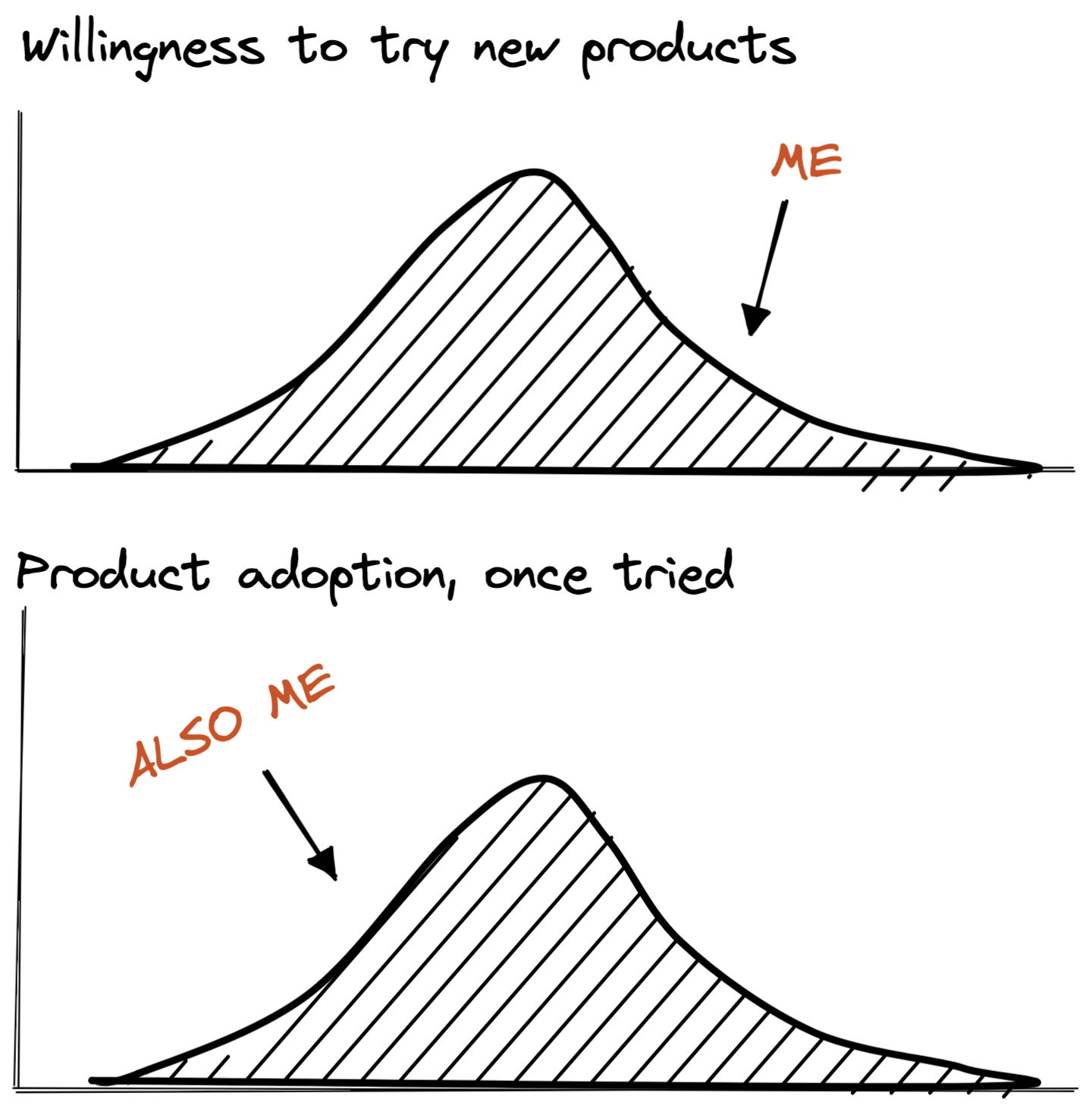
Once I picked up Excalidraw, I haven't put it down. It became my tool-of-choice for diagrams, wireframes, brainstorms, and more. Part of why it was such a good fit for me is that it filled a massive hole in my toolkit. Before the pandemic, I would frequently sketch on whiteboards with my coworkers. In high school, I had a small classroom-sized whiteboard in my bedroom. The pandemic hit me like a ton of bricks in all sorts of ways. At work, one of the hardest parts was losing the white board. Of course, I could get a personal whiteboard, but then I wouldn't be able to really use it for work.
So what is it about this software? Why does it work so well?
You're in
There's no onboarding. No signup. No confirmation email. No OAuth. You're just in the product. Are there any flashy overlay tours with annoying animations and pulsing buttons? Is there a modal upselling you on a paid plan[1]? No. You're just in product, able to use it.
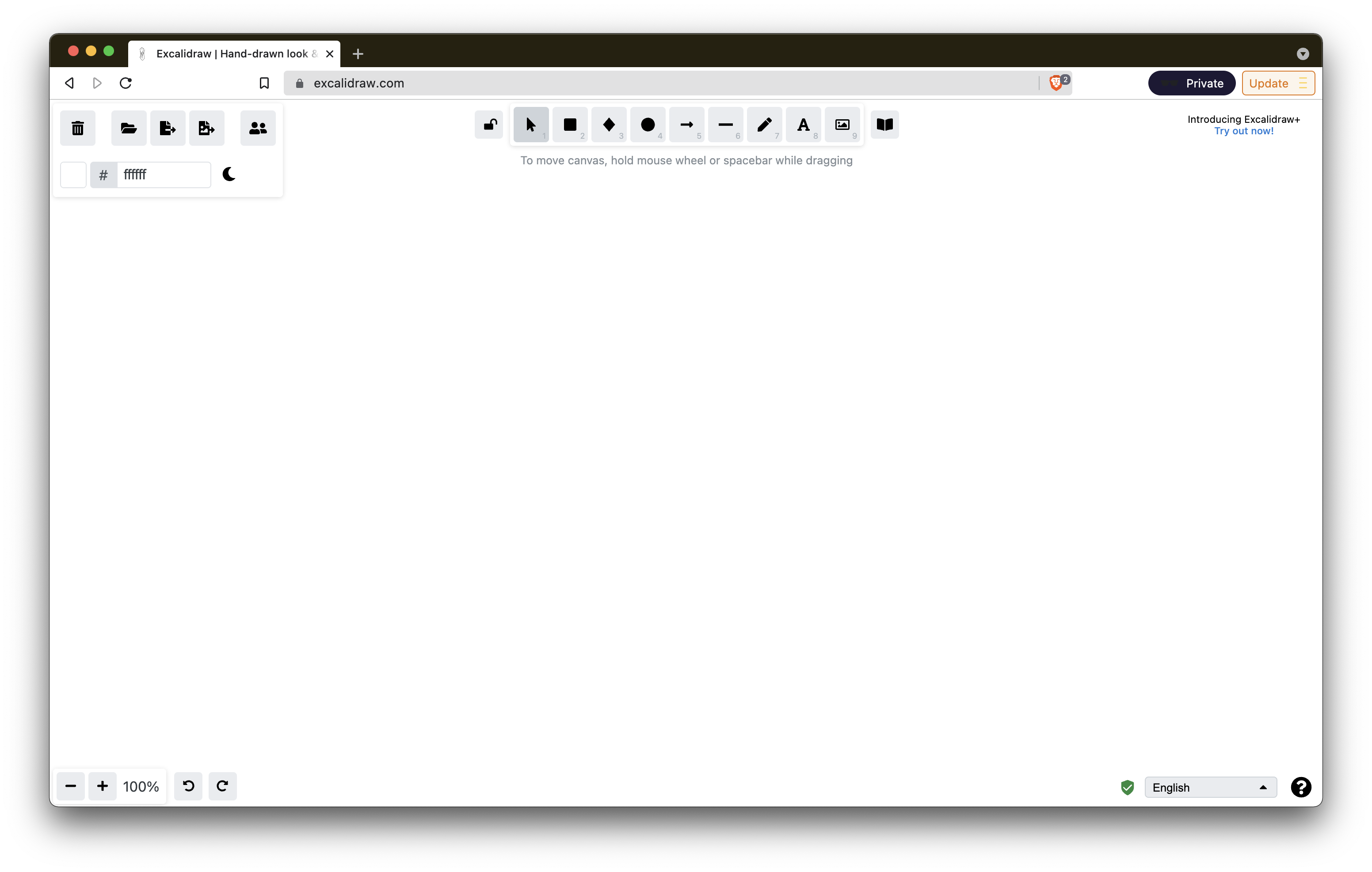
You already know how to use it.
It's not overwhelming. There are 9 tools. The icons tell you what they do. There are no new concepts. If you don't know what something is, you can learn it in about 12 seconds.

Other tools offer quite a bit more power, but require an investment to learn. I've often wanted to try Omnigraffle after seeing what Gabe Lebec could make with it when we worked together. But, every time I've tried it, I've been overwhelmed by the learning curve (not to mention the dollar curve).
I would resort to making diagrams in Keynote, HTML/CSS (just because I know it), Graphviz, or pen and paper.
Low fidelity
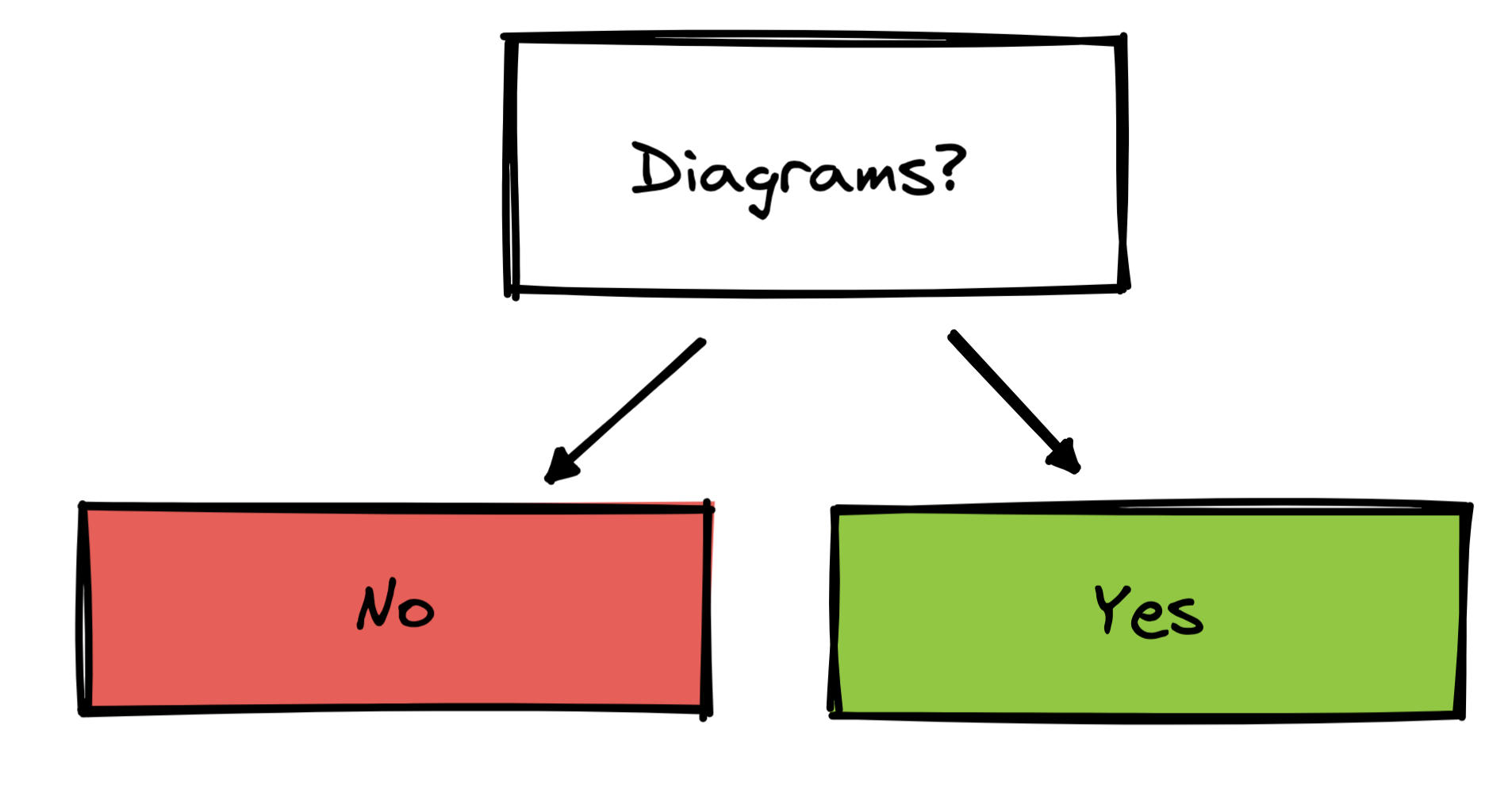
It forces you to stay low fidelity. Because everything is rendered with rough.js (I think...), objects look sloppy and hand-drawn. This liberates you from the details and lets you get to the point. In a proper design tool, an incomplete thought would feel discouraging. The product would beg for polish. In Excalidraw, polish is illegal, allowing you to stay in idea-space.
Intuitive nod to pro tools
It respects standards. I've spent a lot of time learning keyboard commands for other software (Keynote, InDesign, etc), and when I reflexively use them in Excalidraw... they work[2]! Cmd + option + g creates a group, Cmd + option + shift + g removes a group! You can hold down the space bar and drag the screen around. Too see what's possible, hit the question mark in the lower right corner.
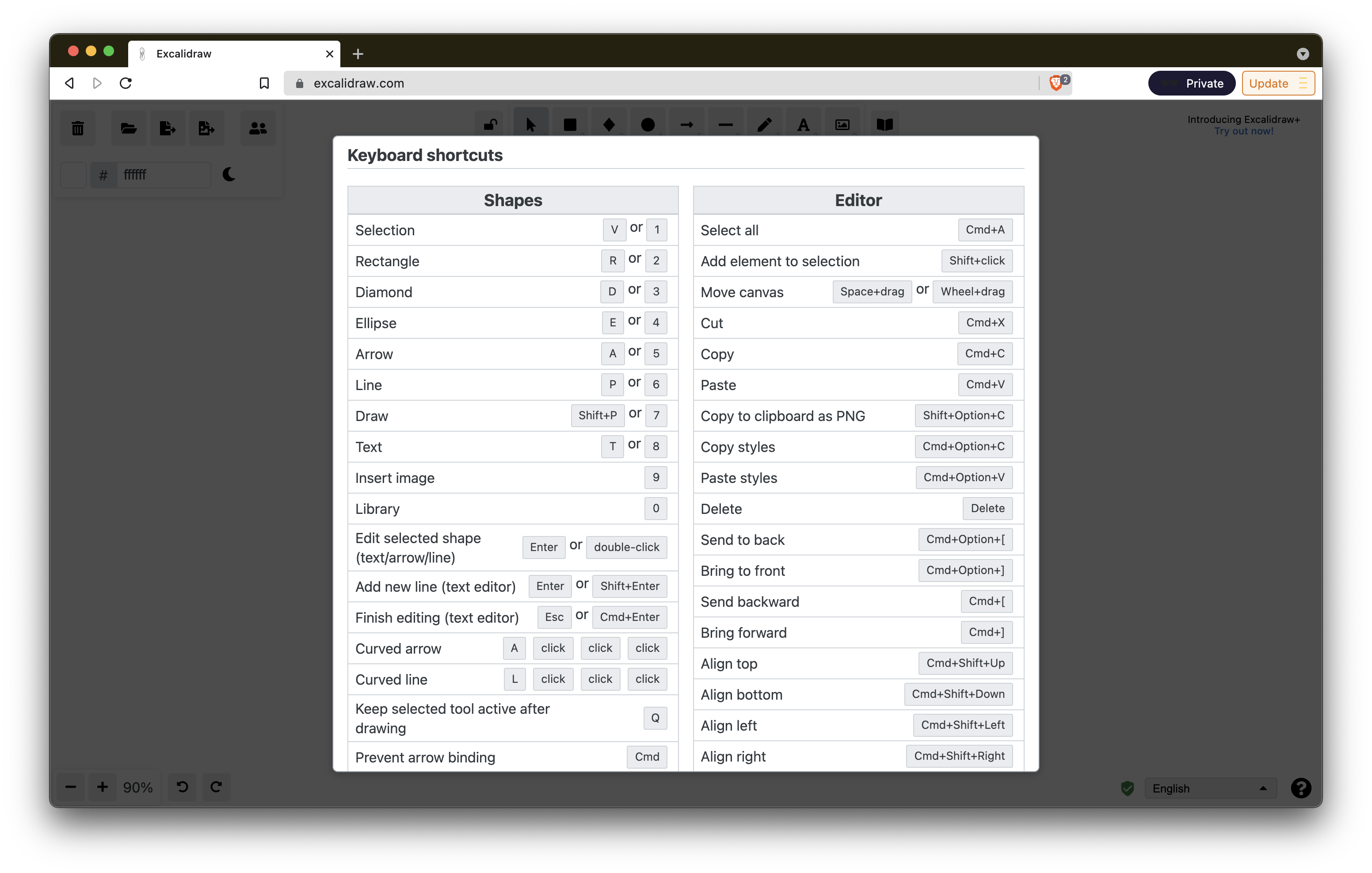
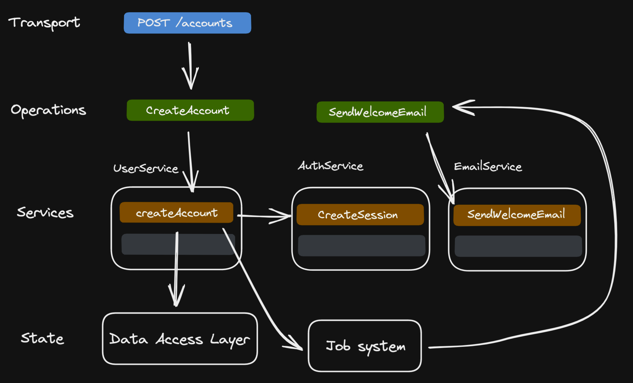
I'm personally not a dark-mode person[3], but some people actually won't use an app unless it looks like the dark side of the moon. Here's a diagram I recently made, rendered in dark mode.
Semantically oriented
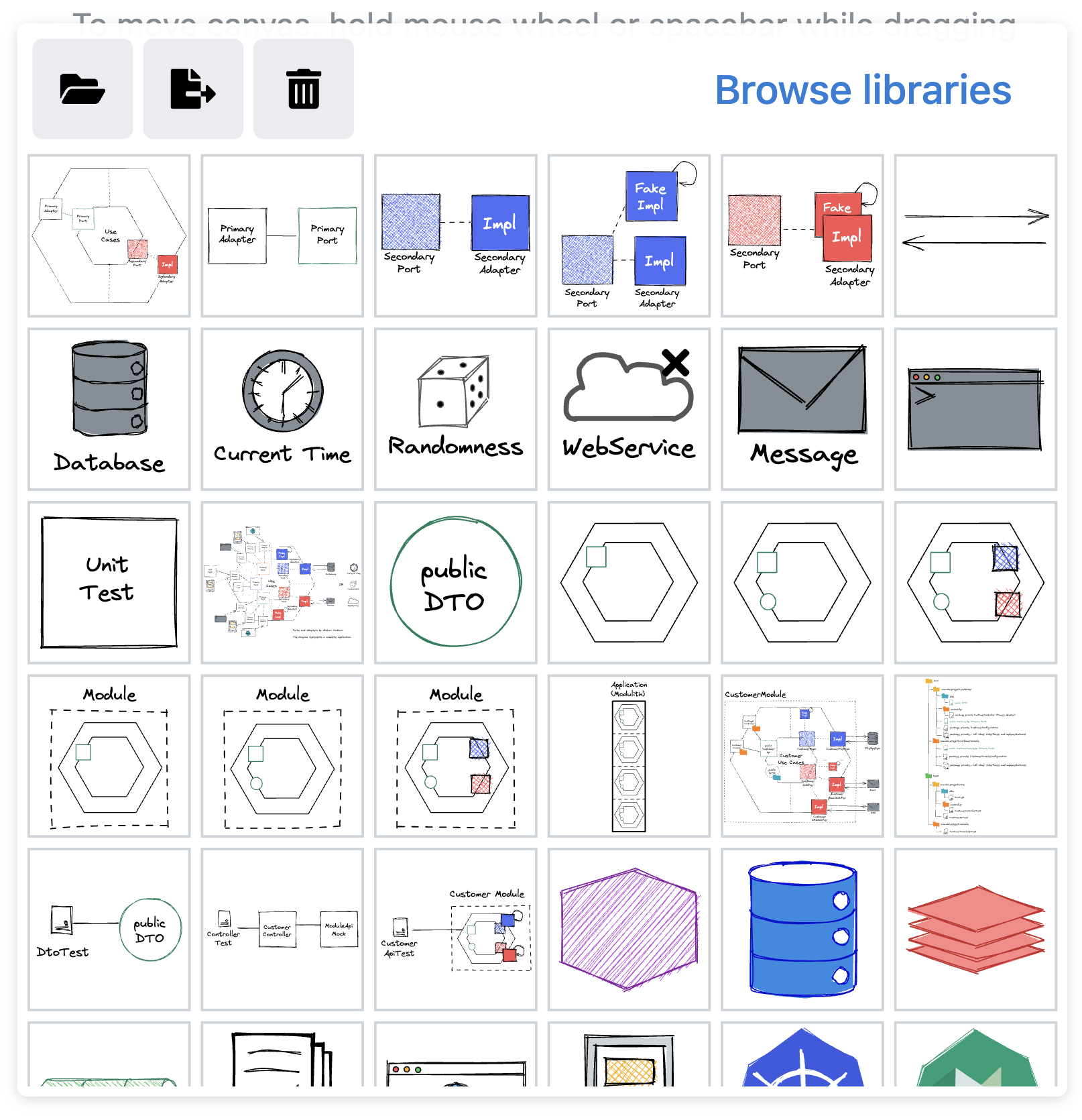
You can build a vocabulary of objects. If you're using combinations of shapes to symbolize something, you can add them to your library of shapes, and recreate them when you need them. This is something I've wanted in Keynote for a long time.
Collaborative with zero friction
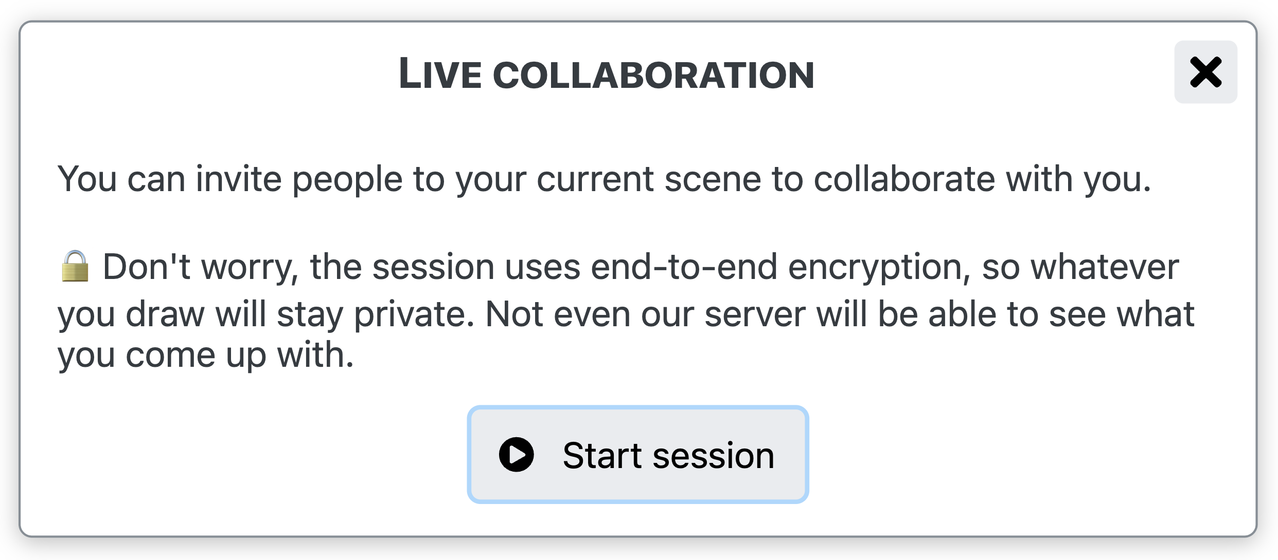
You don't have to be an Excalidraw evangelist to collaborate. Just send a link to your coworker. They don't have to sign up. They don't have to worry that a SaaS company will spam them for the rest of their life. They just click the link, and collaborate.
The takeaway
If you're building a tool and you want your users to love you and to tell their friends:
- Reduce friction to zero
- Make. It. Simple.
- Don't upsell (or if you do, do it tastefully)
- Let users collaborate just as easily
- Build around users' intuition
- Small building blocks can be pretty mighty.
Misc
They have recently taken a tiny piece of screen real estate to sell a paid plan, which is kind of annoying, have to say. But I guess they're a business? At least it's not too disruptive. ↩︎
10 years ago, one of the things I loved about jQuery was how guessable the API was. I remember being able to work on a jQuery app on an airplane (when airplanes didn't have internet) because I didn't really have to look at the docs too much, I'd just guess the function signatures. Sign of a great design. ↩︎
I decided against adding a dark mode to this site, sorry dark-mode stans. ↩︎
- Next: Helping students with pair programming
- Previous: Semantic operation layer